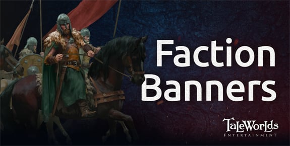
Greetings warriors of Calradia!
In previous instalments of our weekly updates, we introduced you to the major powers of Calradia and talked about the historical influences that we used as a foundation for creating our own take on the early medieval period. In this week’s blog, we thought it would be nice to put a face to a name, so to speak, by sharing each of the factions’ banners with you. After all, this is Mount & Blade II: Bannerlord…
Drawing inspiration from real-world medieval cultures gave us a solid starting point when setting about designing the faction banners. We were able to research the different ornamental styles, sculptures, carvings, metalwork, heraldry and flags of each culture, which gave us some interesting ideas for the direction that we could take each design.
For some of the factions, such as Empire and Vlandia, we had a pretty clear idea in mind for what we wanted to go with from the outset. However, for some of the other factions this proved to be a little more difficult. One example of this is with both Aserai and Khuzait. Initially, we wanted to go with geometric designs for these two factions but eventually decided to move away from this in favour of large shapes and a single focal point. Our reasoning for this was that the banners are displayed in many different places in the game, from actual banners carried by troops into battle to small icons hovering over each city on the world map. We thought that geometric designs could cause too much visual noise when displayed at different sizes and instead we opted to go for designs which would work well at any scale.
Something that tied in closely with this design process was deciding the faction colours. We wanted each faction to have a distinctive colour which would make their troops recognisable in the thick of a battle, while also subtly representing the culture of that faction. In other words, we needed to select colours which are unique for gameplay reasons, but still say something about the faction. One issue we ran into while selecting the faction colours was with multiplayer. We use two different colours for each faction in multiplayer: dark as the primary (team 1) and light as the secondary (team 2). The team colours are displayed in various UI elements, items and clothing so we wanted to ensure that players could easily differentiate between the two teams at a glance and that everything is visually clear for colour blind players.
Aserai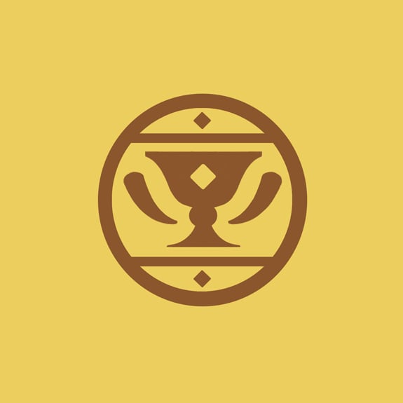
For Aserai we decided to go with a warm colour to represent their homelands: the Nahasa desert of southern Calradia. We looked at a few different options in the orange-yellow range before deciding to go with a deep, almost golden yellow. For the design, we took inspiration from Islamic decorative arts and interiors, going through many different iterations before settling on a cup and horns design, which was heavily influenced by Mamluk blazons.
Battania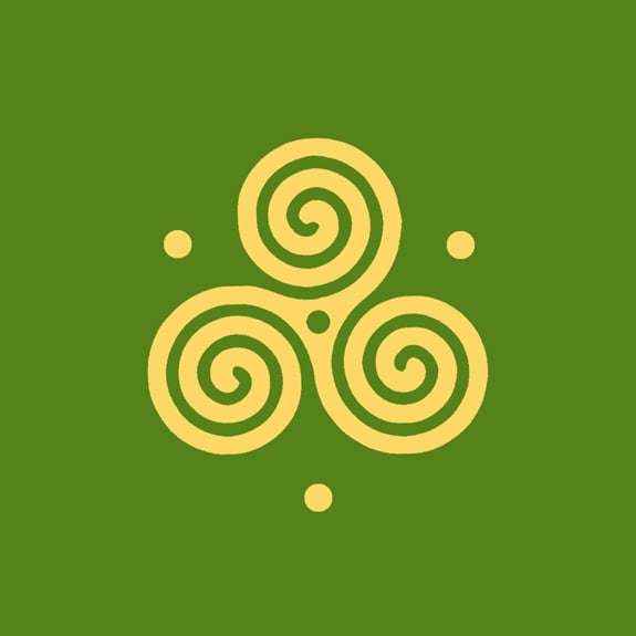
Battania lay claim to the misty hills of north-western Calradia. They are inspired by the Celtic peoples of Western Europe and we felt that an earthy, woodland type of green would be the best choice of colour to represent this faction. We went through a few different design choices for their banner, focussing on animals like boar, deer and rabbits, stylised in a Celtic art style. However, we wanted a more encapsulating image for the faction and decided to go with a design from Celtic culture which is more iconic and recognisable.
Empire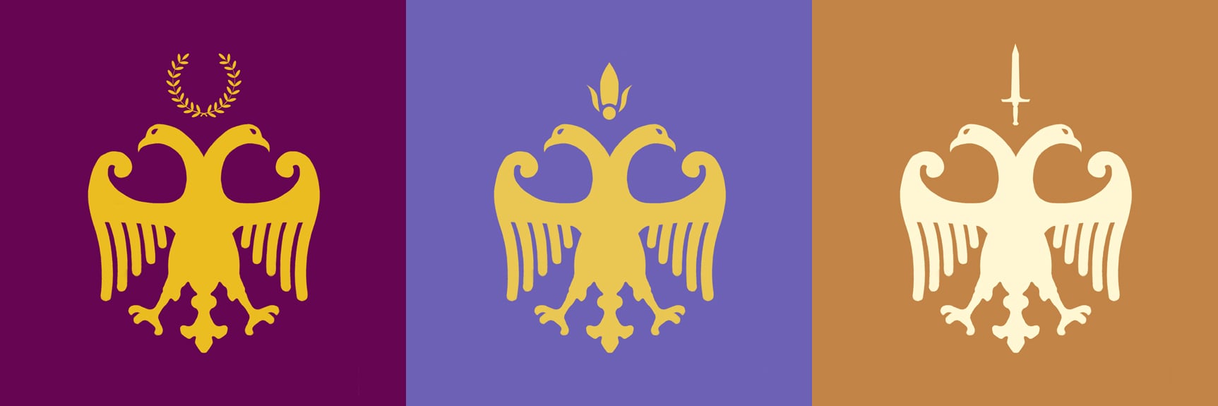
Empire presented us with quite a unique challenge. The design of this flag was pretty much set in stone from the outset: we wanted to use the double-headed eagle as it is a charge that is associated with empire, especially the Byzantine Empire (which this faction takes its inspiration from). However, because Empire is split into three individual factions that are on the brink of a civil war, we had to decide whether to go with completely different banner designs or to use the same banner across all three factions (after all, each of the three rulers claim to be the rightful heir to the throne!). In the end, we reasoned that we should take a route somewhere in between these two options by keeping the general design the same, but giving each banner its own slight variation to represent the ideals of that particular faction.
For the Northern Empire, whose leader was elected by the senate from within their own ranks, we decided to go with a deep purple. Historically, the dye used to create purple garments was extremely expensive and, as such, it is a colour that is commonly associated with emperors, kings and queens. Likewise, for the southern empire we decided to choose a shade of blue-violet. This colour represents stability and nobility, which we think is quite fitting for their leader, Empress Rhagaea, widow of the previous emperor, Arenicos. Finally, we thought that orange, a colour which relates to adventure and risk-taking, would be the best choice for the militaristic Western Empire.
Khuzait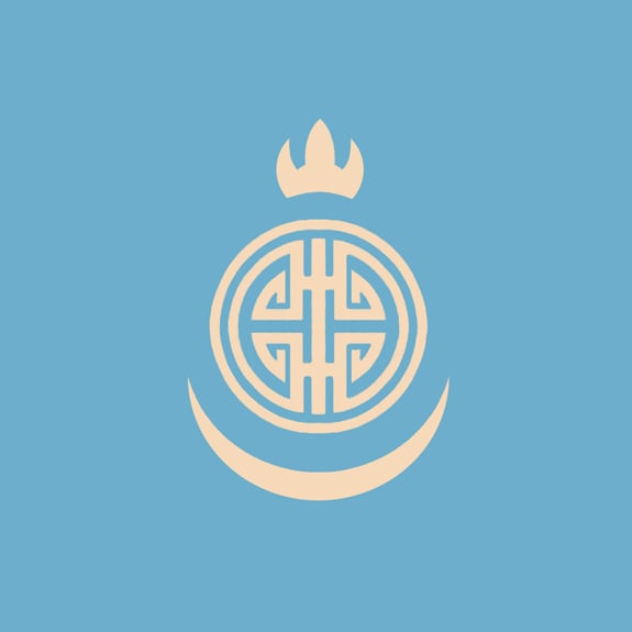
The horse lords, hailing from the eastern steppe of Calradia, draw their inspiration from the steppe peoples of central Asia. We took the colours for the banner directly from the open plains which they roam, with the main colour being a light shade of sky blue. Our original designs for Khuzait drew inspiration from Turkic and Mongolian illustrations but we felt that these designs looked a little too peaceful and we wanted something a little more impactful and aggressive. We decided to incorporate sun and moon shapes into the design as these shapes are important to Central Asian people.
Sturgia 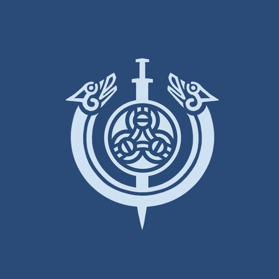
The Sturgians populate the cold and forbidding forests of North-Eastern Calradia. They are based on the federation of predominantly Slavic city states known as Kievan Rus, with influences taken from the many different peoples who travelled to and settled in this region. This gave us quite a bit of free reign when choosing the design for this faction. In the end, we decided to lean more towards the Viking style of art, which we felt would be more recognisable. The Viking shield is perhaps one of the most iconic shields we can think of, so using that in the centre of the design was an idea we had right from the start (the sword just naturally fit in with that!). We combined this with a design taken from some Viking jewellery (a torc) which helped to bring the whole piece together. The dark blue of the banner was chosen to represent the cold and harsh environment in which the Sturgians live, and also the seas which they travelled across from their homelands.
Vlandia 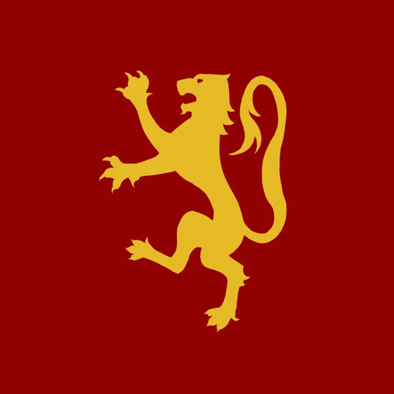
We took our inspiration for Vlandia from the feudal states of early medieval Europe, in particular the Normans. We wanted to use a powerful and aggressive colour for Vlandia, and the natural choice for that was a deep, almost bloodlike red. The lion which adorns the Vlandian flag is a symbol of strength, courage and military might, and was used quite widely in European heraldry. We tried a few different, more complex designs but decided to go with a simpler version that would better suit the early medieval period that the game is set in.
Join the conversation and comment on the forums! (309 comments)